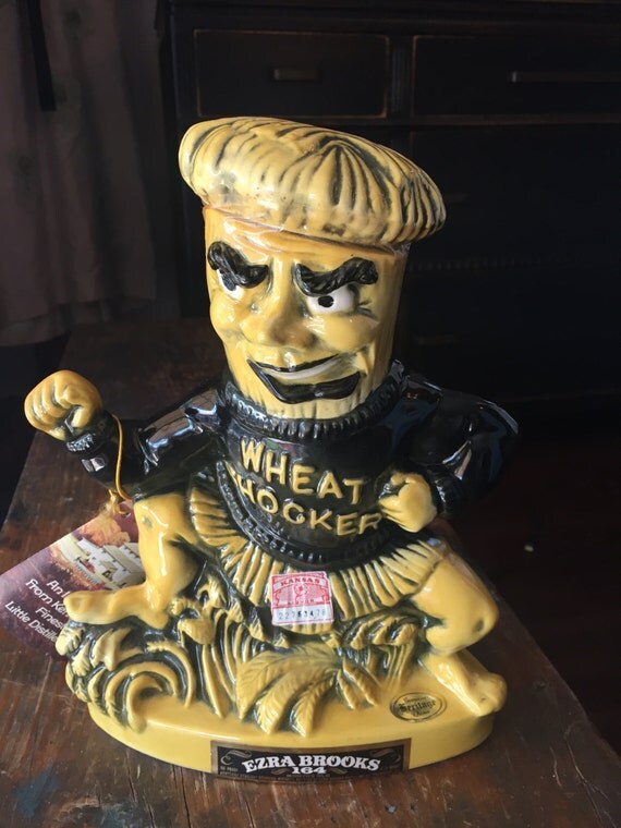
This is way way way off topic, but I was in school when the 1980 Wu was the prototype. I figured out how the geometry of the head worked and could build them out of paper mache for homecoming displays, floats etc. Mind you, this was before cell phones. I am at work the year after I graduate and a buddy finds my work number, calls and asks if I could make one for a sorority. I ask him what does he think it's worth. He reminds me, in light of his companionship desires, it was invaluable. So I fabricated a Wu Shock head several hundred miles away from Wichita, meet him 200 hundred miles down the road, so my buddy would not be lonely. He owes me to this day. I loved the pinched cheek with the wheat stock. No kinder, gentler WU for me. I loved the pissed WU.
Announcement
Collapse
No announcement yet.
Failed Wichita State Logo
Collapse
X
-
-
I was on the staff of The Sunflower back in 2002 when the school unveiled that awful attempt at a new logo. We eviscerated it in the opinion section. Corbett Smith covered it from a reporting angle. I was one of the writers who wrote opinion columns and our editorials on it. Some of the pushback coverage was picked up by the Eagle. We were a pretty proud staff when the athletic department announced they were pulling the plug.
Comment
-
I probably should let sleeping dogs lie but... I was on the focus group that was assembled to review the new logo design that Jim Schaus's athletic department was advocating. Schaus described it as follows; a "kid friendly mascot" and a "third color". He told me that they weren't getting rid of WuShock but they intended to diminish it in their marketing.
I said at the time that I thought this an extremely bad idea because we have very few traditions and none of them as unique as "WU". I went on to share with the focus group that I would be strongly against the changes that the athletic department was contemplating. Later that evening I was at fundraising event at the Orpheum Theatre and shared my thoughts with Dr. Beggs and Shirley. I'm of the opinion that Mrs. Beggs was instrumental in ultimately killing the new mascot ideas.
Comment
-
nmOriginally posted by Aargh View PostThe original WuShock was designed by Wilbur Elsea in 1948. Here's his signed original submission:
A Google image search for "history of WuShock" gave me this:
https://www.google.com/search?q=history+of+WuShock&source=lnms&tbm=isch&s a=X&ved=0ahUKEwiIh5f1pO_SAhWG4yYKHbZWCBUQ_AUICCgB& biw=1024&bih=687
"Prediction is very difficult, especially if it is about the future."
--Niels Bohr
Comment
-
Wonder if the administration plans to revise or update any of the logos like CU did when they joined the new little big east.
Comment
-
It's easy to rebrand when you don't have a brand. (also when you just steal logos from pro baseball teams in canada.)Originally posted by dwbarcl View PostWonder if the administration plans to revise or update any of the logos like CU did when they joined the new little big east.
http://www.omaha.com/creighton/creig...560d29b87.html
Otherwise, it's expensive.
Comment
-
Creighton had to do something with their branding designs because they were looking really tired and low rent. They could've done it 10-15 years earlier, and it would have been money well-spent even then.
On the other hand, WSU just had all of our stuff revised something like five years ago, and it's wearing fine. The WSU AD also had a proprietary typeface developed in the past few months that you now see used on their media stuff, and I'm sure will make it to all sports unis in the near future. I think we're good in that regard.
Comment


Comment