Announcement

Collapse
No announcement yet.

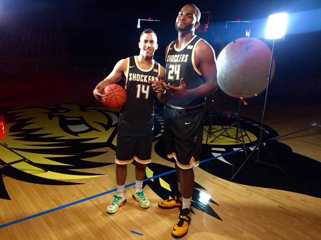
New Road Uniforms

Collapse
X
 
  • Filter
  • Time
  • Show
Clear All
new posts

  • #16
    When you're on the national stage and looking to make a statement, I don't know that these uniforms are distinctive enough. Pretty bland IMHO.

    They could be wearing paper bags for all I care if we are playing in the Final Four.

    Comment


    • #17
      Yeah with the black unis from the 2013 Final Four and on, and last years grays, I thought that particular look was possibly going to continue to get phased in with the others. Then they throw a curveball and change the black unis again. Having a unified "look" in different color schemes seems like a better branding tactic, to me.

      But hey, what the hell do I know about this? Damnit Jim! I'm an Engineer, not a Marketer!

      Comment


      • #18
        It might be the lingering Final Four effect, but I liked the "Shockers" in the official university font on the old black uni's. I appreciated the uniqueness of it. This font looks standard fare.
        "It's amazing to watch Ron slide into that open area, Fred will find him and it's straight cash homie."--HCGM

        Comment


        • #19
          I like standard and non-flashy. I think it would be fun to beat the crap out of everyone while wearing high school jerseys. I understand that sometimes players/recruits like certain shoes and uniforms. But at the end of the day, that isn't what we're doing here.

          Comment


          • #20
            Still waiting on an @Awesome Sauce Malone: take on the new jerseys. IIRC ASM is a bit of a student of uni design.

            EDIT: Whoops, missed the very brief, almost hidden, take in the OP.

            Comment


            • #21
              I want to see a side shot of the shorts. There appears to be a logo or something on each side of the shorts. You can see there's something on the right side of Barney's and the left of Hamilton's shorts.

              Comment


              • #22
                You can see more of the shorts in JR's pick here. http://twitter.com/JRSimon10/status/...152385/photo/1
                Not much going on.

                Comment


                • #23
                  ShockerHoops.net - A Wichita State Basketball Blog

                  Comment


                  • #24
                    Eric is JACKED. I have never seen a freshman at WSU with that much muscle.
                    People who think they know everything are a great annoyance to those of us who do. -Isaac Asimov

                    Originally posted by C0|dB|00ded
                    Who else posts fake **** all day in order to maintain the acrimony? Wingnuts, that's who.

                    Comment


                    • #25
                      It's a Retro/Throwback look, and it's hot, trust me.
                      "Don't measure yourself by what you have accomplished, but by what you should accomplish with your ability."
                      -John Wooden

                      Comment


                      • #26
                        Shaq Diesel looking trim!

                        ShockerHoops.net - A Wichita State Basketball Blog

                        Comment


                        • #27
                          I think they would be better if the numbers, names, and Shockers were all completely yellow. Of course, if they win the national the national championship, I don't care what the unis look like! : )

                          Comment


                          • #28
                            I dig it. Always loved when we wear the road blacks, and I think the new font communicates that we're about to ruin your day if your team is unlucky enough to be on our schedule. The bubbly appearance in the print from prior years looked like a little like it was written by a 12 year old girl with nice penmanship. And while I appreciate a good rope a dope as much as the next guy, I like the more down to business appearance which these feature.

                            Comment


                            • #29
                              I was more impressed by the players than the unis. When the 6'9" guy doesn't look real tall compared to the rest of the players, that's a good thing. When Hamilton looks like a Jr or Sr instead of a Fr, that's a good thing. A guy built like Hamilton who has some - let's call it passion - in his game could be a little intimidating.
                              The future's so bright - I gotta wear shades.
                              We like to cut down nets and get sized for championship rings.

                              Comment


                              • #30
                                Yeah, looking at Shaq's shorts, there appears to be a Wu logo about thigh high on the side, but nothing more than that.

                                Comment

                                Working...
                                X