 Tweet
Tweet
Originally posted by SPEShockAlum
View Post
-
-
Marge: The plant called and said that if you don't come in tomorrow, don't bother coming in Monday.
Homer: WOOHOO! Four day weekend.Comment
-
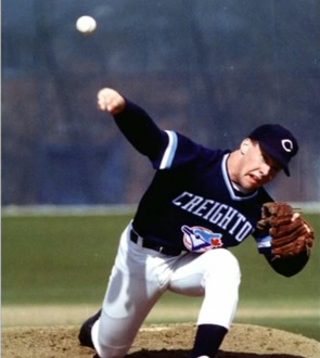
Another look at a former CU basebll uni. Notice they didn't even remove the mple leaf from the Toronto BlueJays logo. That "C" on the cap has a familiar-looking point on the back.
 The future's so bright - I gotta wear shades.
We like to cut down nets and get sized for championship rings.Comment
-
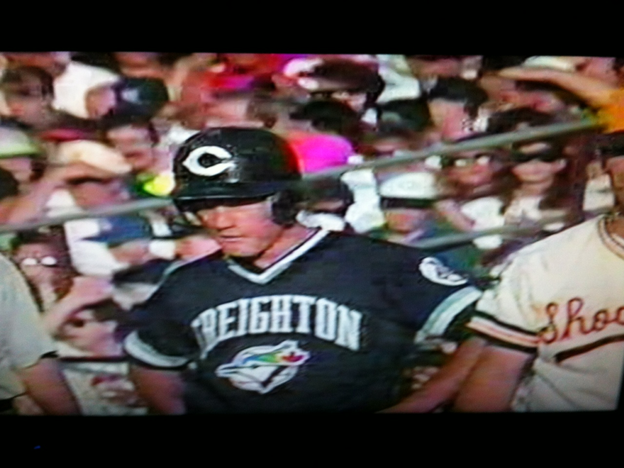
Here's a bit larger picture from the 1991 CWS:
 Kung Wu say, man who read woman like book, prefer braille!
Comment
-
I prefer this picture from the 1991 CWS
Comment
-
Reds hat. Bluejays bird. I said from the first day I saw the new logo it looked just like the Toronto logo.Comment
-
The Creighton jersey with the Blue Jay logo lifted directly and entirely from the MLB team is so low-rent it is hilarious. Looks like something that would be done by a little league team. Considering those screen shots are from the pinnacle of CU's athletic history makes it all the more rich.Comment
-
Their AD told them he wanted "something intimidating. You know, use the Blue Jays logo picture, tweak it and make it yours."Originally posted by SHOCKvalue View Post
The poor deaf designer forgot his hearing aid that day and thought he said "simply imitating. You know, use the Blue Jays logo. Pilfer. Thieve it and make it yours". Besides they were sponsored by Xerox.Kung Wu say, man who read woman like book, prefer braille!Comment
-
-
They didn't. It's still in the baseball jersey posted further upOriginally posted by Cdizzle View PostPeople who think they know everything are a great annoyance to those of us who do. -Isaac Asimov
Originally posted by C0|dB|00ded
Who else posts fake **** all day in order to maintain the acrimony? Wingnuts, that's who.Comment

Comment